YummyRush: Food Delivery App
A conceptual food delivery app exploring how speed, clarity, and intuitive navigation can improve decision making in high pressure moments.
Role
Lead UX/UI Designer
Duration
1 Month (2026)
Tools
Figma, Make, FigJam, Google Stitch, Prototyping
Project Type
End-to-End Mobile App
🎯 The Challenge
Most food delivery apps flood users with unhealthy fast food options that are cheap, low quality, and repetitive. Users looking for quick but healthier, higher-quality, or more diverse meals feel frustrated by limited choices.
✅ The Solution
A food delivery concept focused on improving how users discover and order healthier, high-quality fast food. The experience prioritizes clarity, speed, and a less cluttered browsing flow across multiple cuisines.
- Improving discovery of healthier fast food options without adding friction or decision fatigue
- Structuring diverse cuisines in a way that stays simple, scannable, and easy to navigate
- Streamlining the browsing experience so users can move from exploration to ordering faster
User Insights (Conceptual Analysis)
Pain Point
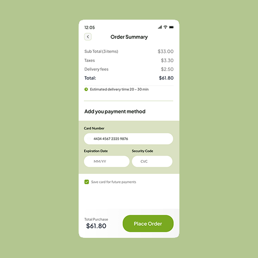
Users often feel frustrated when additional fees only appear at the final checkout stage, creating a sense of loss of control and mistrust.
Market Gap
There is a clear opportunity for healthier food delivery options in suburban regions, where access and variety are often limited.
User Testing
Card-based layouts are generally more effective than text-heavy lists for helping users quickly compare and choose restaurants.
Design Evolution

Exploring card layouts and gesture-based navigation on paper.
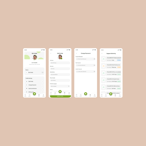
The refined UI using the new brand system and optimized flows.
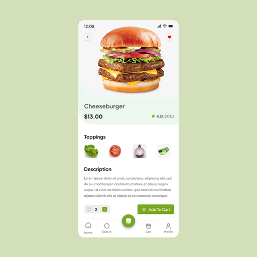
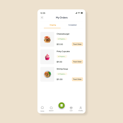
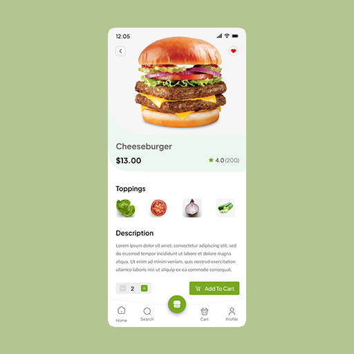
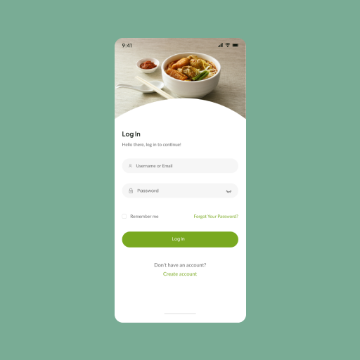
High-Fidelity UI
Key Learnings
Designing for clarity over complexity
One of the biggest takeaways was how quickly food delivery experiences can become overwhelming. Prioritizing simple navigation and reducing visual noise became essential to supporting faster decision-making.
Conceptual iteration and refinement
While this was a conceptual project, I explored multiple layout directions and refined flows by critically reviewing each version against usability principles and common UX patterns.